Rosy -- Branding

Rosy is an evidence-based platform supporting women who have low sexual desire.
The subject of sexual health is deeply personal, often carrying feelings of shame and making open discussion challenging. With this rebranding effort, my aim was to infuse the visuals with warmth and a touch of lightness, thereby rendering sexual health more approachable.
My aspiration was for users to perceive things
"through Rosy-colored glasses"
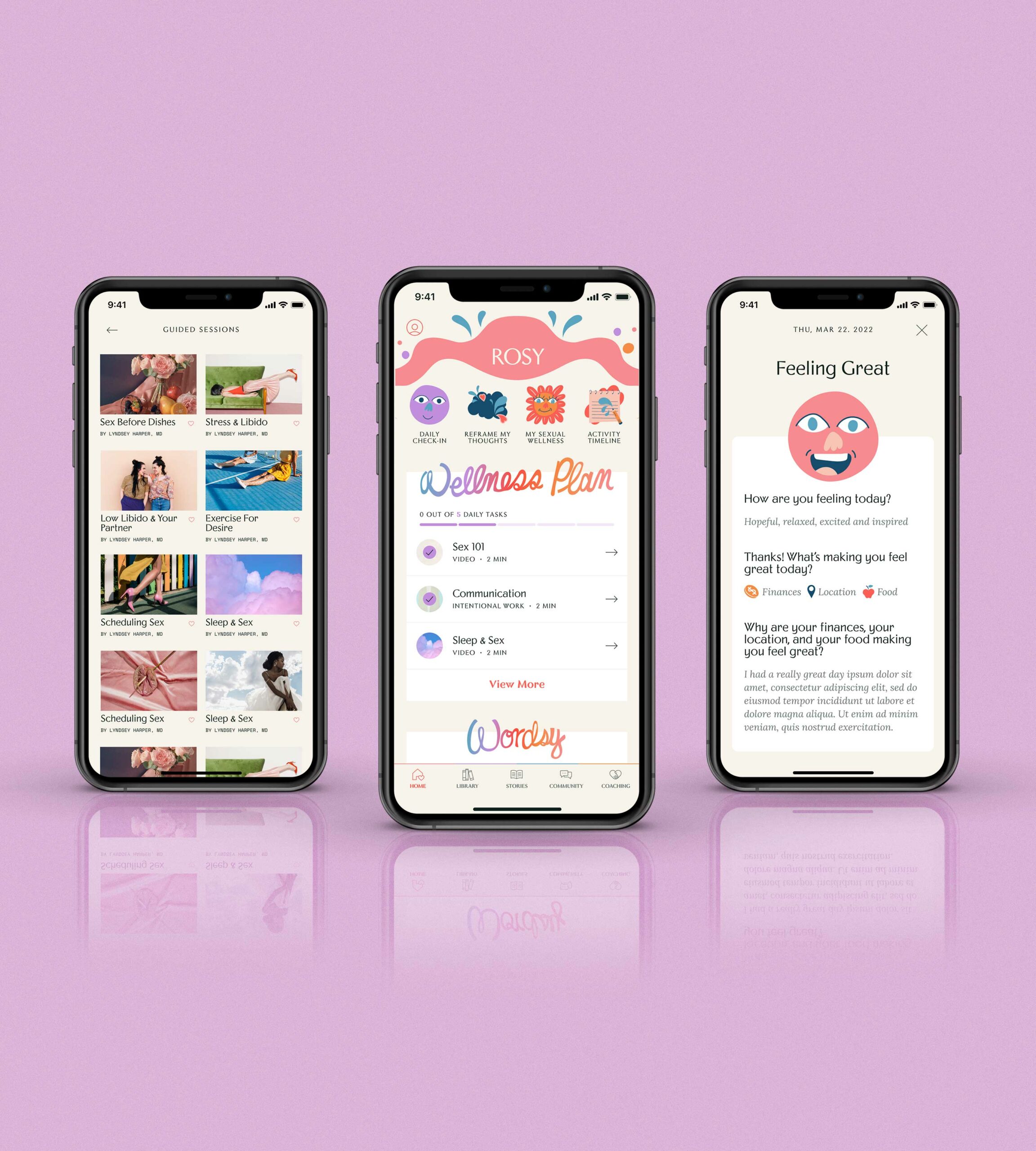

Prior Research & Preparation — Before delving into wireframes and assumptions, I conducted extensive research on telemedicine platforms, successful onboarding experiences, and CBT-based nutrition companies. This research aimed to identify best practices that could be integrated into the existing Foodsmart flow. My focus was on providing comprehensive explanations for each decision, a detailed account of which can be found in the complete case study.
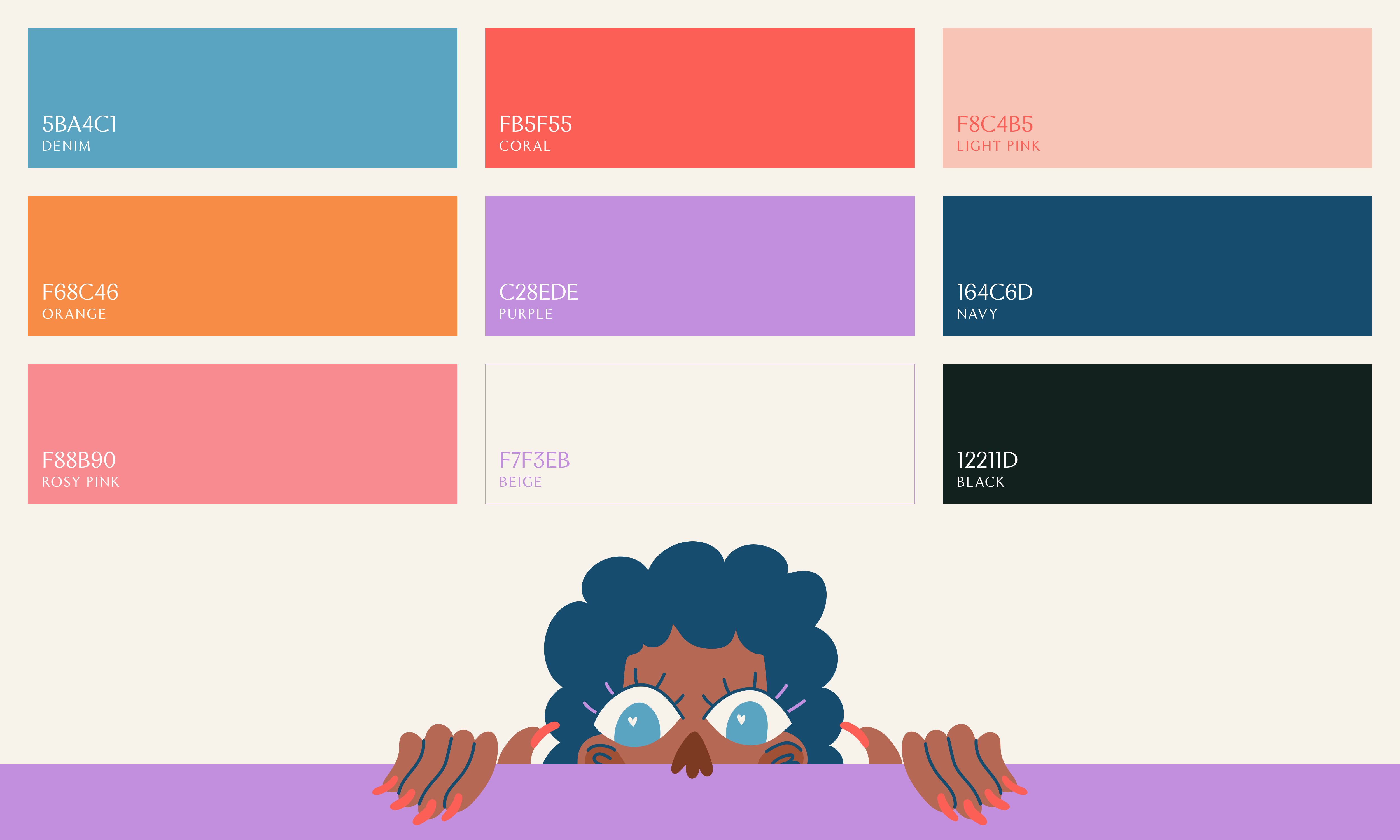

The editorial photography seamlessly contrasts with our fun illustrations. My intention was to foster a sense of inclusiveness among our users, and diversity in both photography and our Rosy girls played a pivotal role in cultivating that atmosphere.


Crafting merchandise for distribution among our users and healthcare network held significant importance. We designed numerous t-shirts and swag items that captured and upheld that enjoyable and uplifting essence.
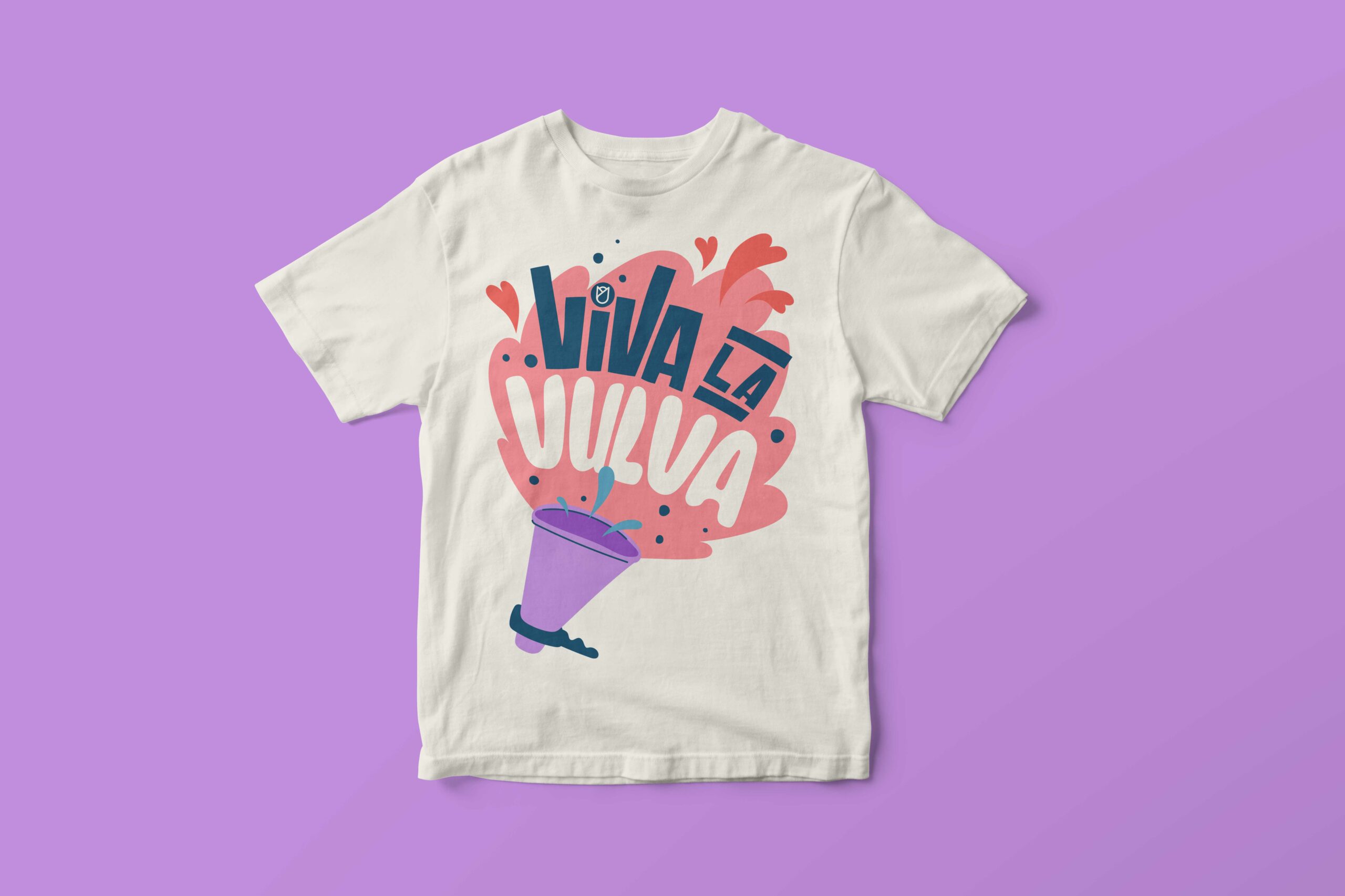
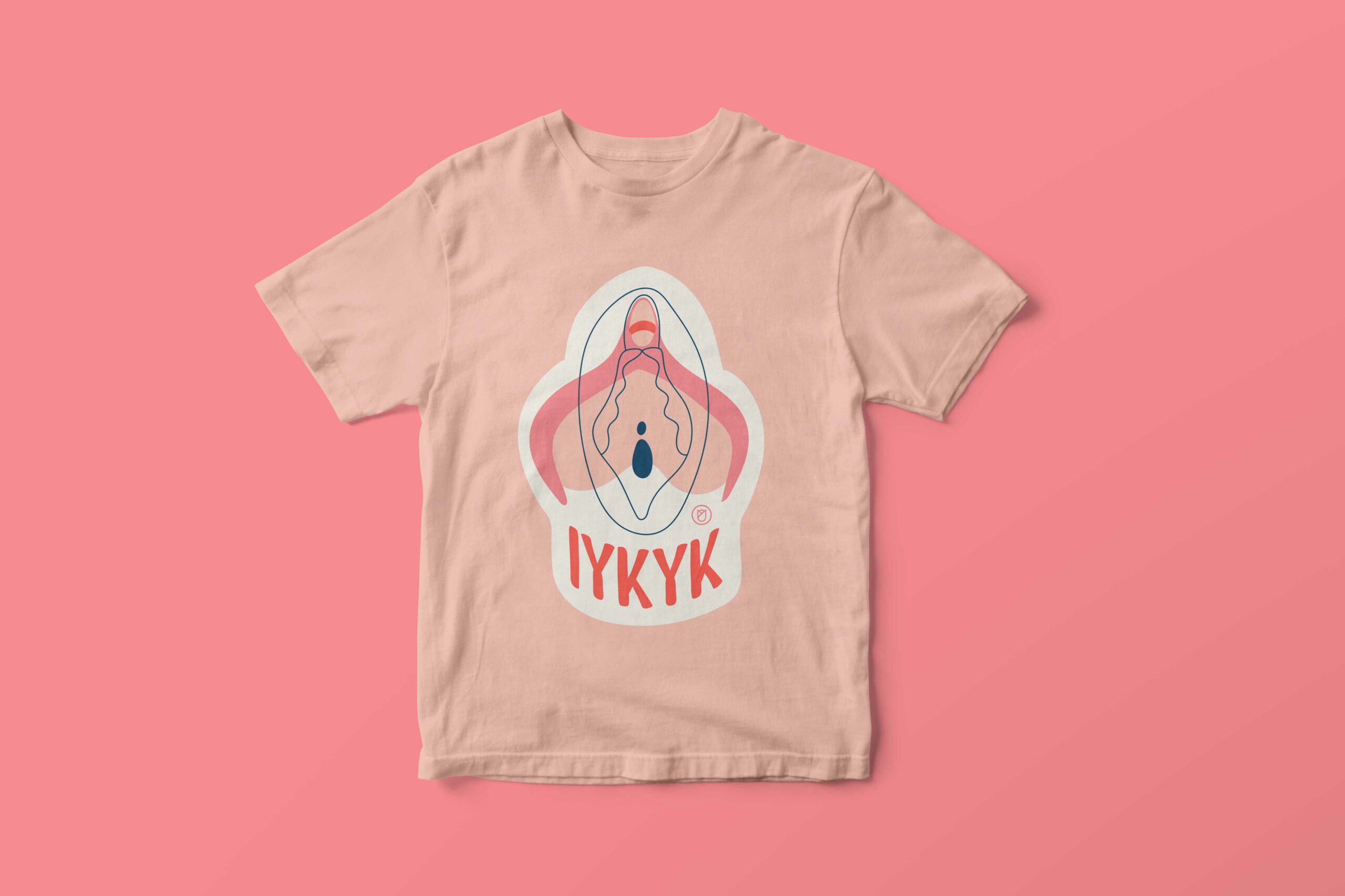
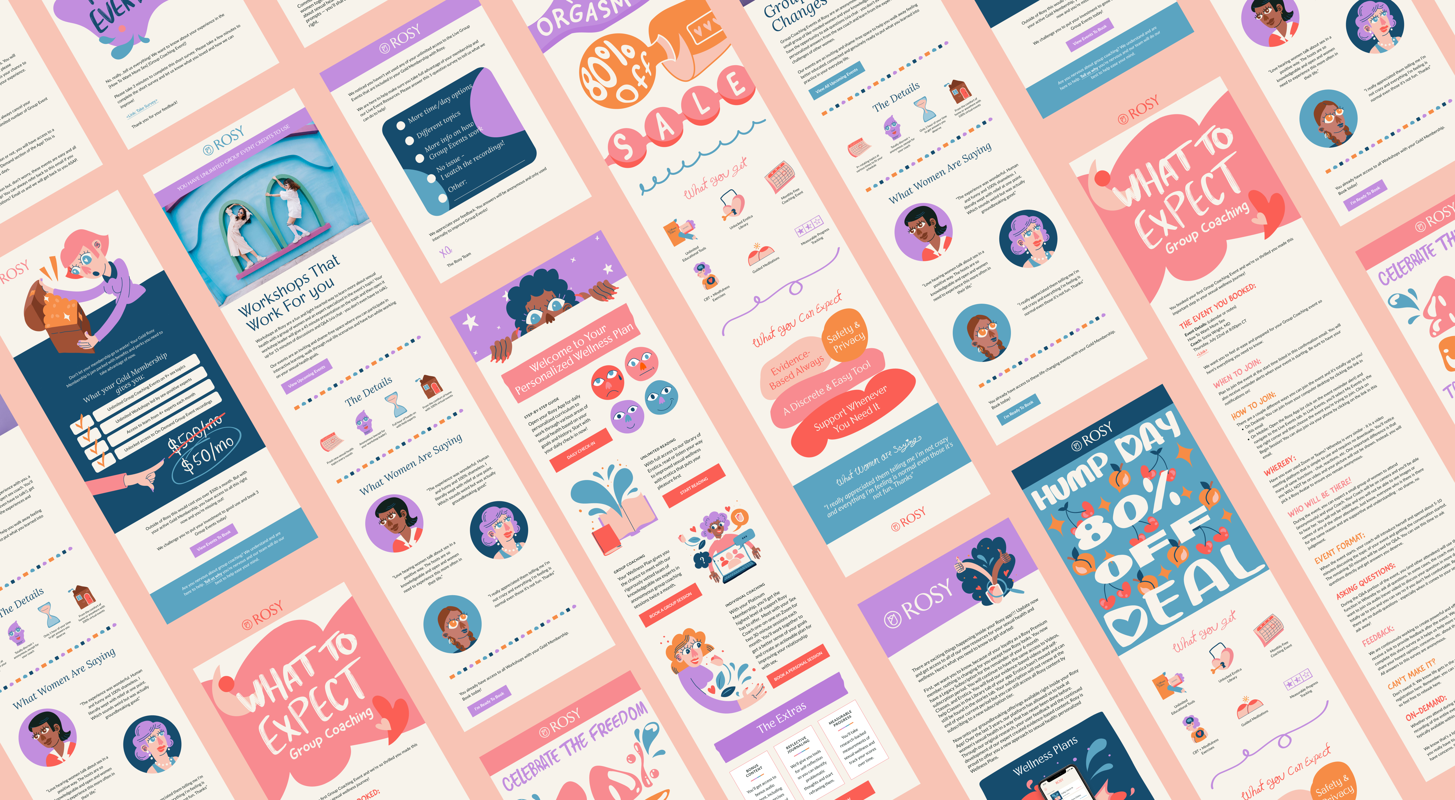
Maintaining this aesthetic across our email campaigns, print materials, website, and app was crucial to achieving a cohesive brand identity that resonated throughout. I aimed to ensure a seamless connection between our branding's playfulness across all touchpoints without any dissonance.
2023 Vanessa de Abreu