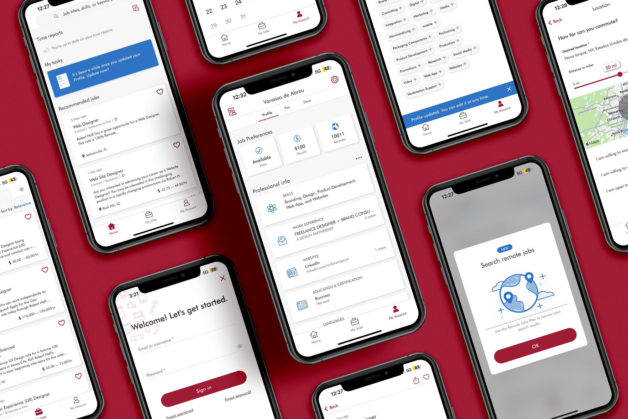
Role: As a member of the starting team for the Robert Half career finder application and website, I aimed to create a user experience (UX) that was intuitive, streamlined, and visually pleasing. One of my key goals was to keep the design as clean and minimal as possible. To achieve this, I utilized techniques such as playing with elevation, using light splashes of color, and incorporating simple iconography. By doing so, I was able to help users easily navigate the platform without feeling overwhelmed or distracted by unnecessary elements.
Given the amount of information available on the site, I wanted to make sure that users could easily sift through and digest it all. As a result, I placed a strong emphasis on UX design, ensuring that the platform was not only aesthetically pleasing, but also user-friendly and functional. By creating a clean and minimalist design, I was able to help users focus on the content without any unnecessary distractions.
Overall, I wanted to create an experience that was both visually appealing and easy to use. By keeping the UX clean and minimal, I was able to help users quickly and easily find the information they needed, while also making sure that they were not overwhelmed by the amount of data available.

2023 Vanessa de Abreu