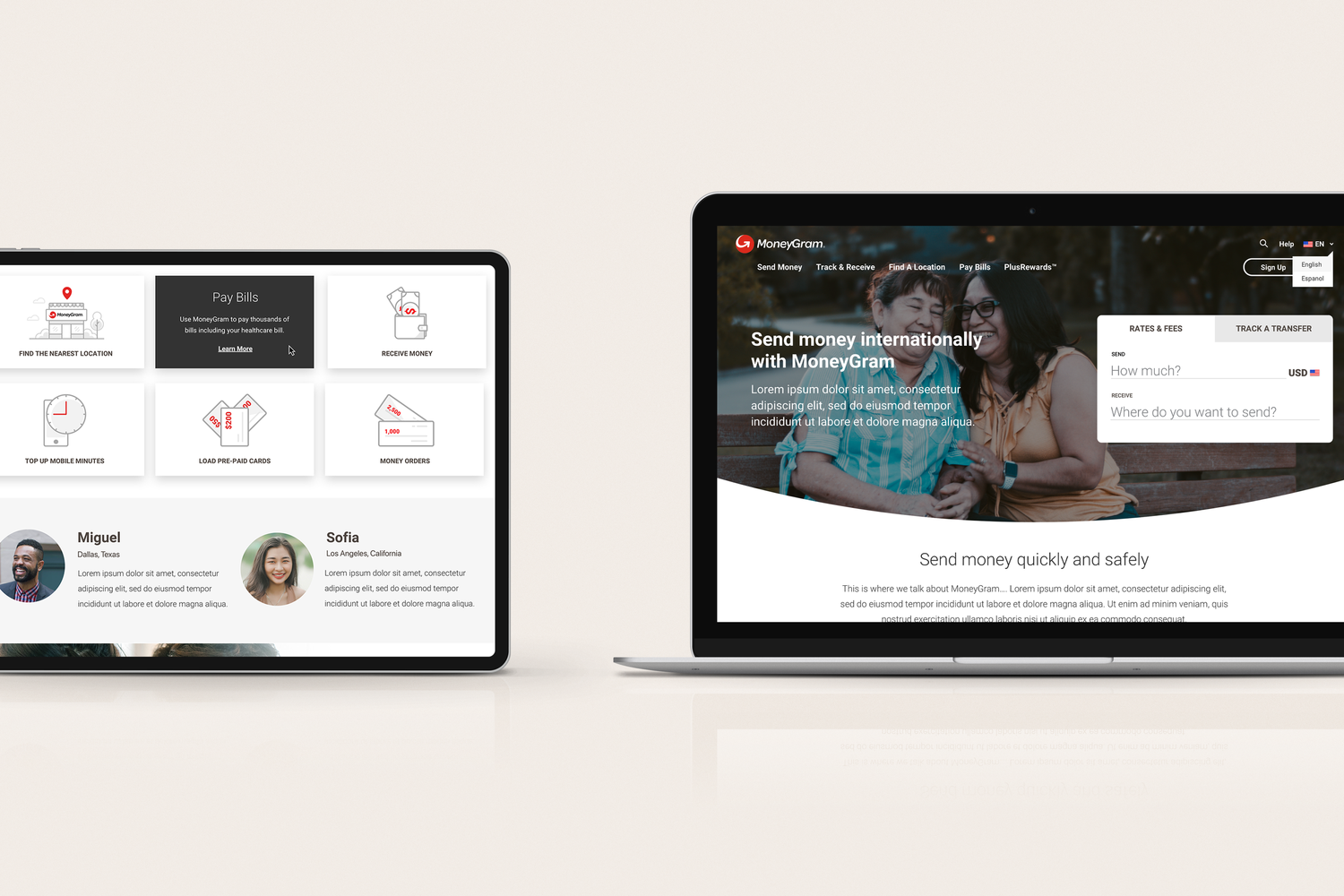
Summary: As the design lead for the MoneyGram website, I made it my priority to create a cohesive user experience across all devices, particularly between the desktop and the redesigned mobile app. I accomplished this by incorporating a minimalistic design approach, utilizing soft curves, and implementing delightful iconography that was both visually pleasing and intuitive to use. In addition, I made sure to use relatable imagery that would resonate with our target audience. I also streamlined the site's information architecture, simplifying the menu structure and eliminating unnecessary elements that could detract from the user's focus.
In addition to these technical considerations, I worked closely with the development team to ensure that the site's design was optimized for performance and accessibility, including considerations such as page load times, browser compatibility, and compliance with accessibility guidelines.Overall, my approach to designing the MoneyGram website was focused on creating a seamless and intuitive user experience that would help to build trust and engagement with our users, while also ensuring that the site was efficient, reliable, and easy to maintain from a technical perspective.

2023 Vanessa de Abreu